Strategy in play˙and Creativity at work˙
“Here’s how alI those weeks of thinking comes to life.”

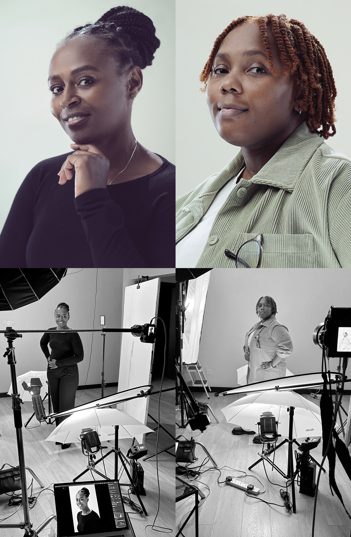
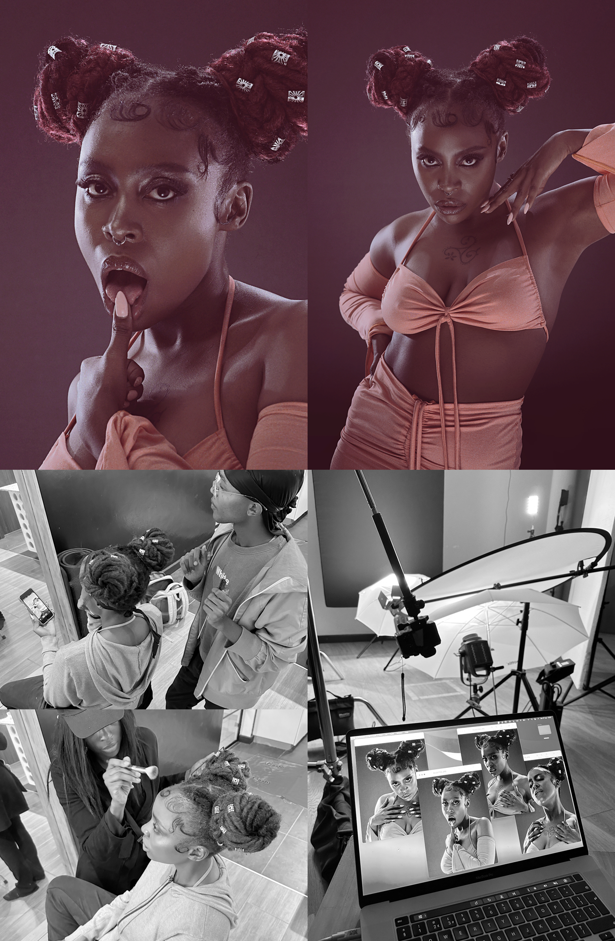
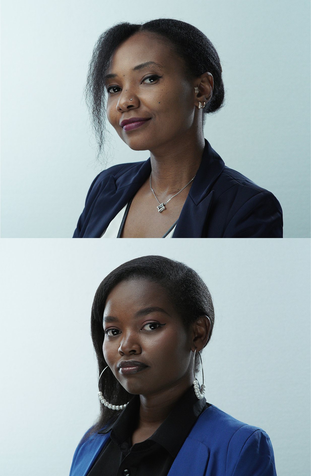
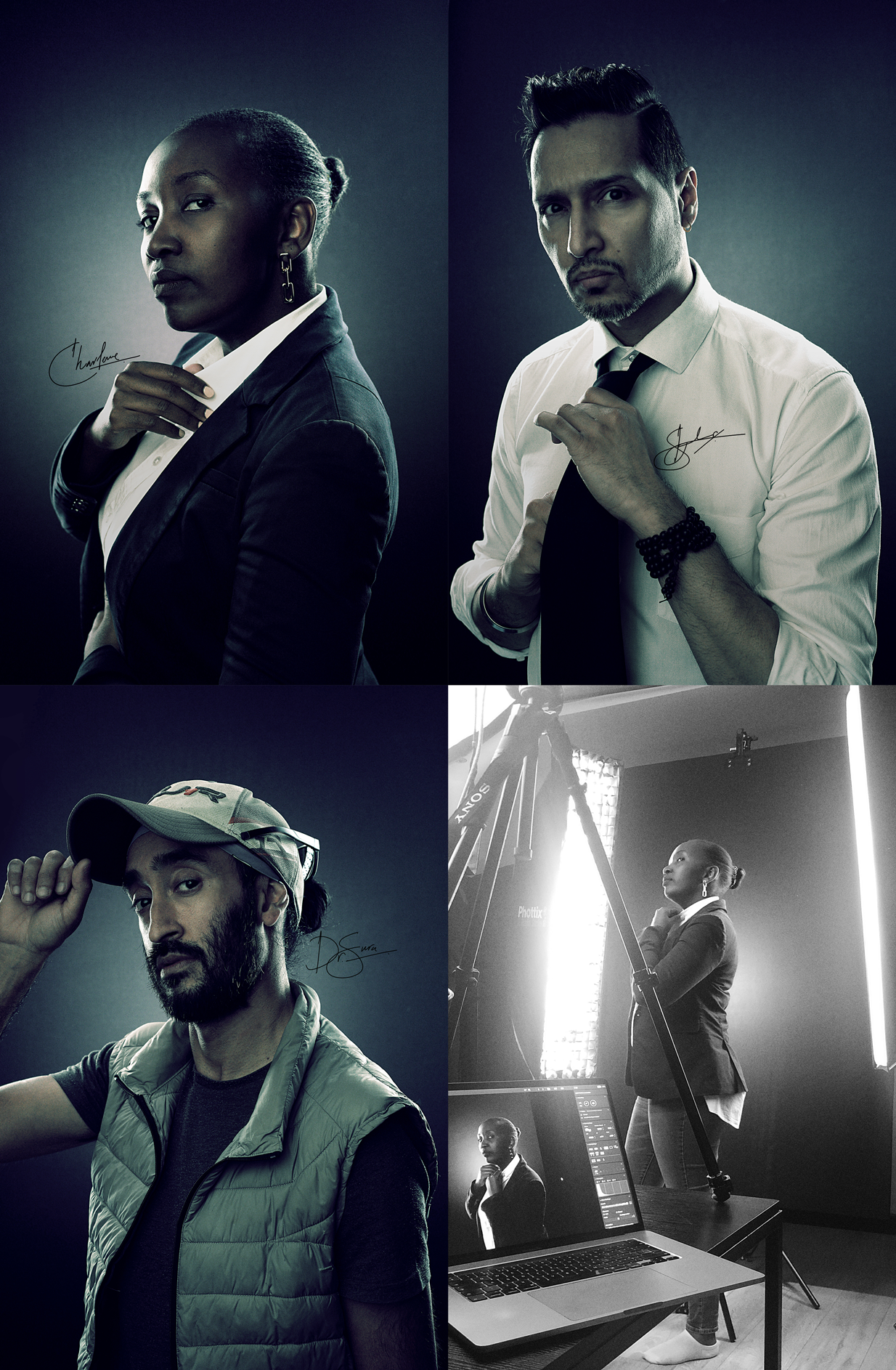
I don’t just think about strategy - I make it real. From design and production to 3D, photography and film. Adobe Illustrator, Photoshop, DaVinci Resolve and Shapr 3D help turn ideas into finished work.
I love seeing every project through, from end to end - until it looks and feels right.
Expect insights that shape ideas, design that takes form and craft that handles every detail with intention. Let’s chat and get thinking!
Want a deeper look? Learn from my recent projects with behind-the-scenes insights and creative lessons.
-
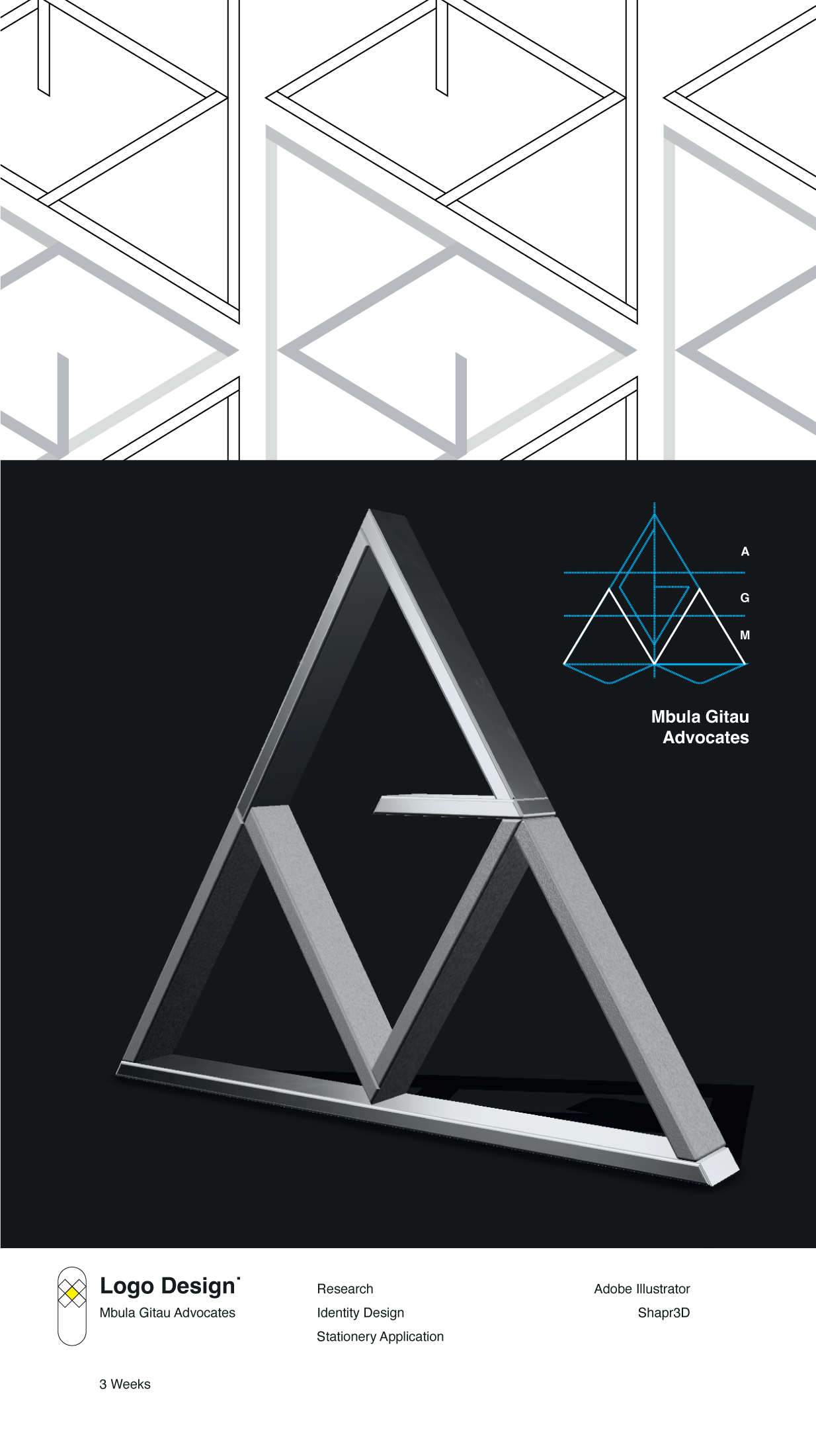
Overview / Challenge: A seasoned corporate lawyer was launching her own practice. In Kenya, firms must be named after the principal, so the task was to create a distinctive identity around the founders names - Mbula Gitau.
Approach / Process: Started with a positioning mini-sprint to define the firm’s personality (precise, modern, dependable). Explored monogram structures that interlocked M - G - A - without feeling ornamental. Built a visual language that balances authority with approachability.
Solution / Deliverables:
• MGA monogram + primary logo lockups
• Corporate profile (firm story, services, sectors)
• Proposal template
• Stationery system
• Web direction (ongoing)
Outcome / Impact: A sharp, memorable identity that reads as MGA at a glance - professional and flexible for digital and print, and simple to deploy across documents. The practice launched with consistent materials and a clear story.
Partnership / Stakeholders: Worked directly with the founder and her core team.
-
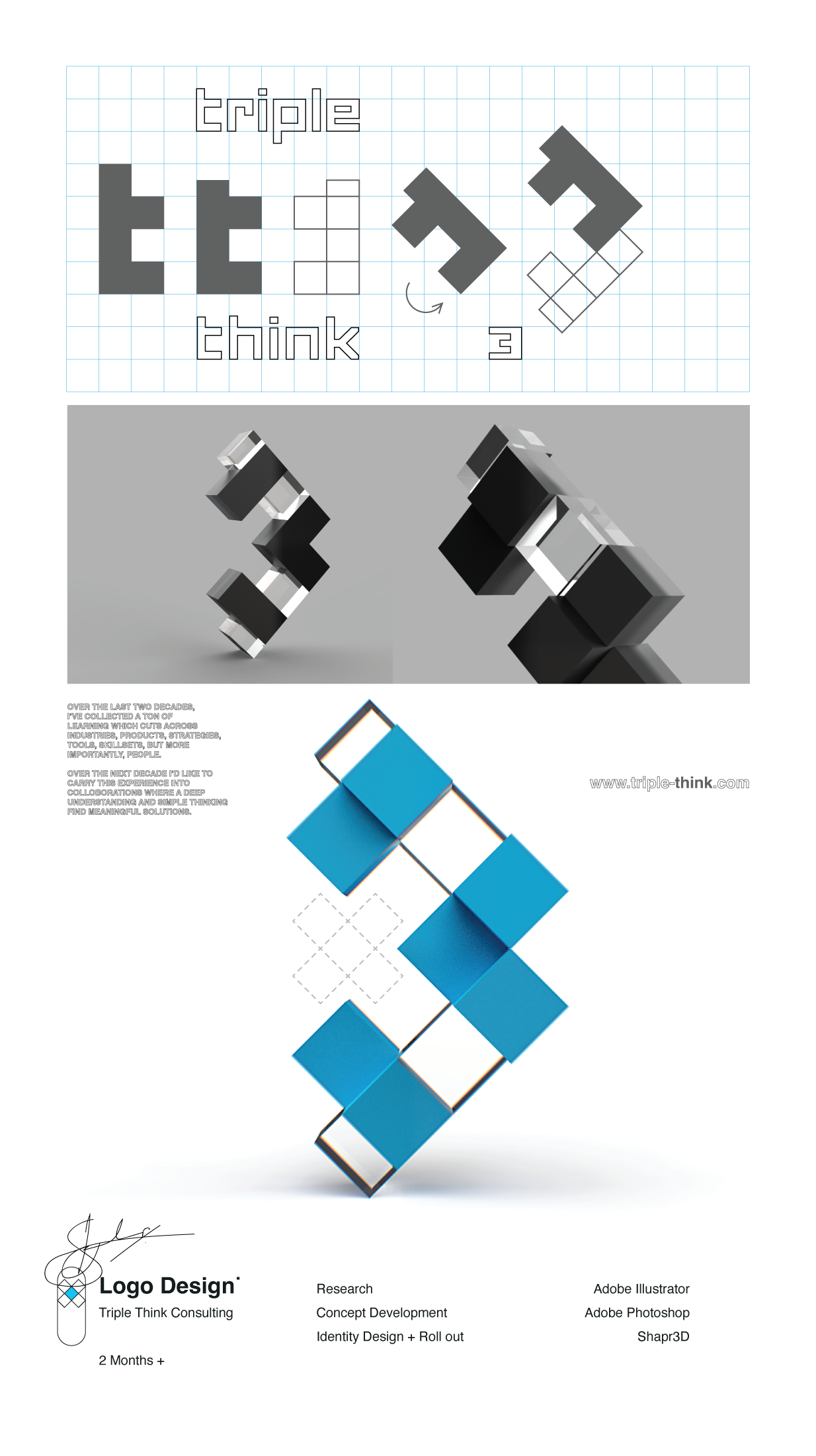
Overview / Challenge: After years of building brands for clients, it was time to build my own. I wanted to create something that felt authentic and reflected how I think, work and live.
Approach / Process: I started where most founders get stuck - naming. After testing countless directions (Yellow Crate, Full Turn, Yellow Sketch) and laughing through honest feedback from friends, I discovered a pattern: I’ve always seen things from multiple angles, thinking, rethinking, and thinking again. That insight, plus my love for the number 3, led to the name Triple Think.
After weeks of ‘overthinking’, I realised the answer was in front of me: two lowercase ts, flipped and mirrored, forming the number 3. Simple, clever and deeply personal - a mark that captured layered thinking, balance and meaning.
Solution / Deliverables:
• Brand name and thinking philosophy
• Logo design and identity system
• Website and YouTube channel
• Presentation and communication templates
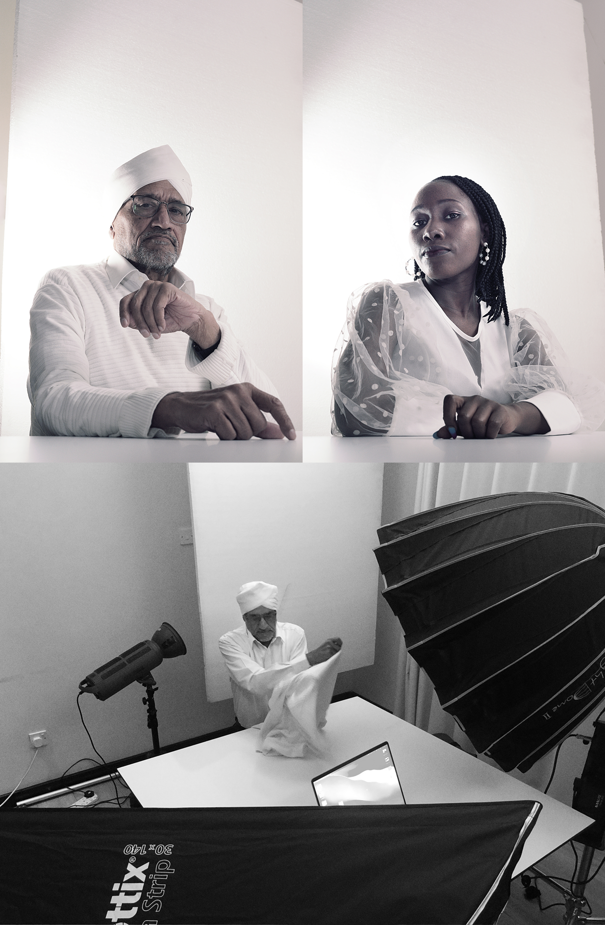
• Video and photography direction (ongoing)
Outcome / Impact: Triple Think became my living portfolio; a brand that grows as I do. It’s the perfect expression of thinking that works: purpose-led, flexible and human.
Partnership / Stakeholders: Self-initiated, self-built and self-driven.
-
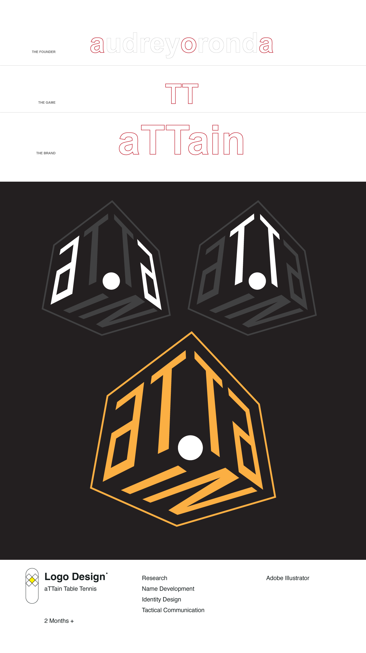
Overview / Challenge: Audrey Oronda, a leading figure in Kenya’s table tennis community, wanted to create a unifying brand that could hold all her initiatives; from Parkinson’s therapy programs to girls’ empowerment and professional coaching - all under one meaningful name. The challenge was to find a name and identity that kept table tennis at its core, while expressing growth, purpose, and inclusion.
Approach / Process: I started with naming exploration, testing words that symbolized progress, empowerment, and motion.
We landed on aTTain: a name that holds Audrey’s initial “A”, the twin “TT” of table tennis, and a dot that represents both the i in her name and the ball in play. From there, I developed a complete visual and narrative system built around connection and possibility.
Solution / Deliverables:
• Brand name + logo system (symbol + wordmark)
• Brand strategy and manifesto
• Social media identity and content design
• Visual storytelling and rollout strategy
Outcome / Impact: aTTain is becoming a movement uniting diverse initiatives under one promise: “Table Tennis with Purpose.” The identity balances sport and storytelling, giving Audrey a foundation to grow from local tournaments to national programs.
Partnership / Stakeholders: Worked directly and very closely with the founder.
“Think once. Think twice. And thrice is where you’ll find the magic.”


