The Power of a Brand Name
˙Sandeep Sura – “When a name feels right, it doesn’t just label; it connects.”
[Approx; 10 minute read]
The journey of aTTain began with one big question: How do you create a brand that connects a person, a company, and a cause - without losing the heart of what started it all? This project was more than a design brief. It was a search for an identity, that could unify purpose, sport, and people under a single name.
…
Blog Contents
1.Listening Before Naming
2.Finding the Name That Fits
3.Turning Meaning Into Design
4.FAQs
…
Project Overview: Brand Creation
Brand: aTTain
Industry: Sports, Wellness, and Empowerment
Specialization: Table Tennis, Parkinson’s Initiatives, Coaching & Community
…
1. Listening Before Naming
Working closely with the founder, Audrey Oronda, it was clear that she wanted to build something bigger than herself. For her; Table Tennis had become more than a sport; a tool for therapy, confidence, and belonging.
The real challenge was how to make it last. In a landscape filled with short-term projects and one-off initiatives, Audrey wanted her vision to become something that could sustain impact, not just spark it. Something that could grow beyond a single event or campaign; a platform that would outlive its founders and inspire others to build from within.
That meant the name couldn’t just sound clever. It had to carry continuity; a word people could stand behind, expand, and evolve with.
TOP TIP: Start with meaning, not marketing. The most important thing to do is listen, don’t brainstorm.
…
2. Finding the Name That Fits
The next step was to shape the insights into structure. The goal wasn’t just to name a project; it was to define a platform that could grow with every initiative that would follow.
That meant asking better questions;
-How do we keep Table Tennis at the heart of everything while creating a promise that connects with everyone and every goal?
-How do we design a name that holds both individual identity and collective meaning?
-How can a single word represent therapy, performance, empowerment, and community; all at once?
The process began by mapping those questions into themes: Purpose, Connection, and Continuity.
From there, ideas surfaced: names that celebrated unity (Paddles United), progress (Bounce Beyond), and inclusion (Tables of Change). Each one worked in part, but none captured the whole. They described moments, not movements.
And then came a quiet breakthrough.
The word attain kept surfacing; an everyday word that felt both achievable and aspirational. It appeared naturally; in the way Audrey described her dream of helping people attain confidence, attain wellness, and attain progress through play. It surfaced again in how the coaches talked about players attaining new levels of discipline and focus. And in how parents and community members described the program’s impact; attaining joy, attaining balance, attaining purpose.
It wasn’t forced. It was already there... quietly shaping their vocabulary. That was the signal. The word attain didn’t just summarize what they did; it embodied what they believed. It spoke to effort and reward. To what athletes strive for. To what communities hope to sustain.
But there was more to it.
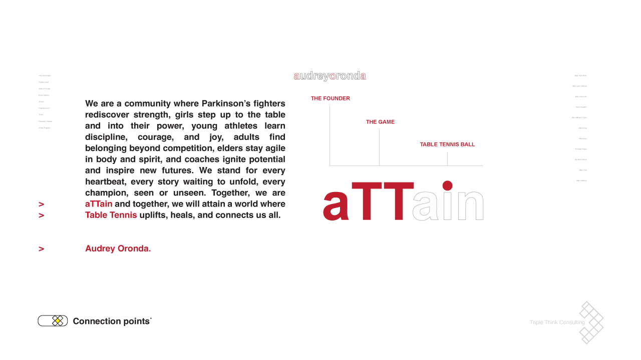
Within the word itself, the double ‘TT’ felt symbolic; a subtle, silent nod to Table Tennis, anchoring the entire story without needing to shout. The lowercase ‘a’ mirrored the humility of its founder, Audrey, while the dot on the ‘i’ became a reminder of focus - a ball in play, a point of purpose. This wasn’t just a name. It was a design of intent.
TOP TIP: Ask the kind of questions that make you pause. The right name doesn’t emerge from creativity alone - it comes from clarity of purpose.
3. Turning Meaning Into Design
Once the name aTTain was defined, the next step was to give it form; to make the meaning tangible. The goal was to build a visual language that could grow alongside the brand’s purpose.
We started with the letters themselves. The double ‘TT’ wasn’t an afterthought; it became the heartbeat of the design, symbolising Table Tennis, the sport that united every initiative under aTTain. It grounded the logo with motion, rhythm, and balance, the same principles that define the game.
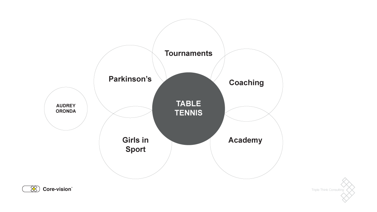
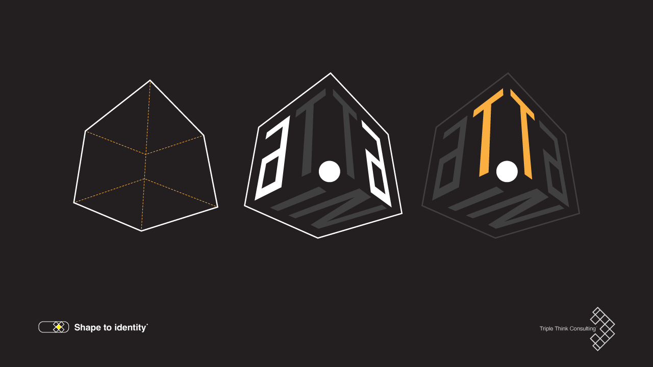
But the real insight came from looking at what happens between those letters. Every initiative; whether for girls, Parkinson’s, or coaching - represented a different facet of the same purpose. That led to the idea of the cube: a container for meaning, each face representing therapy, training, tournaments, empowerment, and community.
Designing the cube wasn’t about geometry; it was about philosophy. It became a way to show how aTTain holds space for many stories - stable, yet dynamic; simple, yet layered. From every angle, it reveals something new, just like the people and programs it represents. In motion, the symbol feels alive: echoing the bounce of a table tennis ball, the rhythm of play, and the human energy at the heart of the brand. What began as a name for a cause became a living identity, one that moves, breathes, and evolves just as the community does.
TOP TIP: Look into meaning before visuals. When every element has a reason to exist, the brand tells its own story - even in silence.
…
Conclusion
Most projects in sport, especially at the grassroots level, begin with passion but fade when funding or focus runs out. Looking back, aTTain wasn’t built to be another initiative. It was built to endure; to grow roots, not wings. Audrey’s vision has become a shared one, where every player, coach, and volunteer feels part of something larger than themselves. And that’s the true power of naming with purpose.
#TripleThink #BrandNaming #LogoDesign
…
FAQs
1. How do you create a meaningful brand name?
Start by listening; not brainstorming. The best names come from real stories and authentic purpose, not just creativity. When a name grows from meaning, it becomes a story people want to belong to.
2. What is the connection between brand strategy and design?
Naming and design are two parts of the same story. Strategy gives direction; design gives it form. When both align, a brand stops being a logo and starts becoming a language.
3. How can storytelling improve brand identity?
Storytelling gives emotion to structure. It turns naming, color, and form into something people remember and relate to. A strong story is what keeps a brand alive... long after the campaign ends.
Hello! I’m Sandeep Sura, Founder and Creative Director of Triple Think Consulting. With over two decades of experience in the Advertising industry, my passion for everything that has to do with Brand building drives everything I do. I love blending my creativity with strategy to deliver impactful work. If you have any more questions or want to collaborate on any projects for your brand - feel free to get in touch. To contact me > click here
Thank you for reading! I’d love to hear your questions or thoughts - leave a comment below!


